If you've been following along with my
wet cyanotype experiments, you've seen some of the prints I made using this exciting, new-to-me technique. My ultimate goal when printmaking is to use them in an art quilt, so I picked out some of my favorites and set out to make a quilt.
Because one of the first sets of wet cyanotype prints had developed during and despite a summer storm, and because of the mysterious and anticipatory feel they all have, I'm naming this one
Storm Watch.
I often use complex patchwork to frame my imagery, but these prints are already complex, and I wanted to keep the emphasis there, so I patched them together using simple strip work. What's decidedly not simple are the fabrics I used--all silks, many of them Mysore silks brought back from travels to India, which have a wonderful sheen and texture. Many of them are "shot" silks, woven with different colors in the warp and weft, which change in appearance depending on which angle you look at them. I also mixed in the rougher textures of raw silks and tweeds, and some selected re-purposed silk ties. It ended up medium sized by my standards, around 50" square.

I'm only showing previews of the work at this point because the stripwork will change rather dramatically once it's quilted. I love the texture and dimension the stitching creates and that's one of the reasons I work in this medium. Quilting will also change the prints, and here I run into a design opportunity. Because more traditional cyanotypes are a very stark blue and white aesthetic, I usually use bright or contrasting threads to add color and interest, like in this detail from
The Organic Landscape:
 |
| The Organic Landscape, detail |
Or this one from
Japanese Anemone:
 |
Japanese Anemone, detail
|
But for these prints I want to preserve the delicacy of the imagery, so I will need a lighter touch. I'm still mulling over how to proceed.
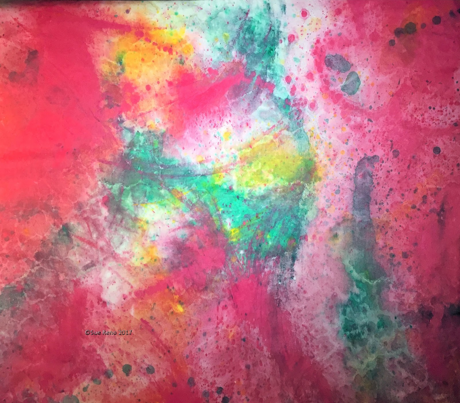
In the meantime, a new quilt needs a new backing fabric, so it's time for another installment of "Look What I Made on my Driveway". I started with a piece of damp cotton sateen and drizzled it with diluted hot pink textile paint.
Followed by a drizzle of green:
And some yellow highlights:
It was an absurdly humid day, and even after misting it with the hose the paint wasn't moving around much, so I had to get in there with a gloved hand and swirl things around a bit. After drying, rinsing, drying again, and ironing, I ended up with this:
It's very pink! Fortunately I don't harbor any color prejudices, and I think it will be the perfect back for this quilt. My art quilts are made to hang on the wall, so the back is not normally seen, but it makes me happy to have something cheerful there while I am working on it.
And finally, as I was standing on a chair to take that picture of the backing fabric, I looked down at the chair and noticed this:
It's pretty much the same color palette as my fabric. I had covered the chair seat with a handwoven Guatemalan fabric years ago, and it's always made me happy. It's a good reminder that it's important to surround yourself with things that resonate with your personal aesthetic, because they do end up being a subconscious influence.
As always, thanks for reading and commenting.


1 comment:
The "gloved hand" worked great on your background piece. I've enjoyed seeing your new cyano prints! So interesting..
Post a Comment